Polymorphic React Button-or-Link Component in Typescript

Adam Boucek
|August 4th 2023

For a long time, the web platform has faced a persistent issue with accessibility, specifically in distinguishing between links and buttons. Traditionally, a link (<a>) has been used to navigate to another page, while a button (<button>) is used to execute an action. Adhering to this convention is crucial.
However, with the rise of single-page applications, the lines between links and buttons have become somewhat blurred. In these applications, clicking links no longer triggers a full page reload; instead, they often only update specific parts of the page. In some cases, links might even be entirely replaced by inline actions, making it more challenging to distinguish between their purposes clearly.
To minimize the use of ternary operators across the codebase, we’ve created a component called Action. This component can dynamically render either links or buttons based on the provided props.
Polymorphic
Before we proceed, let’s clarify the term “polymorphic.” It means having multiple forms or types. Thus, referring to a “polymorphic” component signifies that a single component can take on various forms internally.
In this context, designers often seek a unified appearance for interactive elements like buttons and links. Meanwhile, developers require a straightforward interface to apply these shared styles while ensuring the HTML remains semantic and accessible. The polymorphic component serves this purpose, allowing both consistency in design and ease of use for developers, striking a balance between visual appeal and functionality.
Usage
We’re going to create a component named Action, giving users the option to utilize it as a button (<button>)or as an anchor tag (<a>). Typescript will be employed to enforce and validate the correct props for each scenario to ensure proper usage. However, you can name the component whatever you find adequate.
Firstly, let’s set up a simple styling to distinguish links from buttons easily.
styles.css
a {
 color: #007bff;
 text-decoration: underline;
 cursor: pointer;
}

a.disabled {
 cursor: not-allowed;
 color: #d9d9d9;
}

button {
 padding: 10px 20px;
 cursor: pointer;
 background: #007bff;
 color: #fff;
 border: none;
 border-radius: 4px;
}

button.disabled {
 background: #d9d9d9;
 cursor: not-allowed;
}
Our first thought on how to determine to render an element might be: If we pass a href prop, the output should be a link (<a> element); otherwise, we will render a button(<button> element). This fairly simple component uses the variable React.ElementType and might look like this:
action.component.tsx
import React from "react";

type ActionProps = {
 children: React.ReactNode;
 href?: string;
 onClick?: () => void;
};

const Action = (props: ActionProps) => {
// Ternaty operation to decided whether to return <a> or <button> element
 const Action = props.href ? "a" : "button";

 return <Action {...props} />;
};
export default Action;
We can use our new Action component like so:
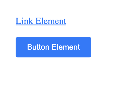
...
<Action onClick={ () => alert('Hello') }>Button Element</Action>
<Action to="#">Link Element</Action>
...
Voila! Our created Action component is functional and accessible. However, we are missing many functionalities. For instance, what if I need to make the action disabled? We can create another a bit more sophisticated polymorphic component, like so:
2. Vesrion of action.component.tsx
import React, { ReactNode } from "react";

type ActionProps = {
 to?: string;
 onClick?: () => void;
 disabled?: boolean;
 children: ReactNode;
};

const Action = ({
 to,
 onClick,
 disabled,
 children
}: ActionProps) => {
 if (to) {
  // If the 'to' prop is provided, return a link (<a>)
  return (
   <a href={to} className={`${disabled ? "disbaled" : ""}`}>
    {children}
   </a>
  );
 } else {
  // If 'to' prop is not provided, return a button (<button>)
  return (
   <button onClick={onClick} disabled={disabled} className={`${disabled ? "disabled" : ""}`}>
    {children}
   </button>
  );
 }
};

export default Action;
As you can notice, we are not using React.ElementType, because <a> and <button> elements contain different attribute sets.
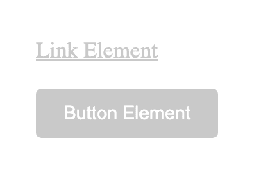
...
<Action disabled={true} to="!#">Link Element</Action>
<Action disabled={true}>Button Element</Action>
...
Even though we had to add more lines of code, our component can handle <a> and <button> elements and disabled attributes with proper styling.
Although we have a well-working and accessible component, we are still missing many attributes that either <a> or <button> might need in the future, such as rel, target, type, autofocus, form, and more.
For that, we will implement React.ButtonHTMLAttributes and React.AnchorHTMLAttributes props. With simple logic operators & and | we can select what type of element and set of props we need. Also, we can add custom base props variables we want to use for our component.
All of that might look like this:
3. Version of action.component.tsx
import * as React from 'react';

type BaseProps = {
  children: React.ReactNode;
  className?: string;
  variant: 'primary' | 'secondary' | 'outline' | 'link';
};

type ActionProps = BaseProps &
  (
    | (React.ButtonHTMLAttributes<HTMLButtonElement> & {
        as: 'button';
      })
    | (React.AnchorHTMLAttributes<HTMLAnchorElement> & {
        as: 'link';
      })
  );

const Action = ({ className, variant, ...props }: ActionProps) => {
  const allClassNames = `btn btn--${variant} ${className ? className : ''}`;

  if (props.as === 'link') {
      const { as, ...rest } = props;
    return (
      <a className={allClassNames} {...rest}>
        {rest.children}
      </a>
    );
  }
  const { as, ...rest } = props;
  return <button className={`${allClassNames} ${rest.disabled ? 'disabled' : ''}`} {...rest} />;
};

export default Action;
...
<Action as="button" variant="primary" disabled={false}>Button Element</Action>
<Action as="link" variant='link' href="#!">Link Element</Action>
...
Final Thoughts
Our Action component contains additional logic that can handle all <a> and <button> attributes. However, the main idea we want to cover is that any crucial accessibility or security-related functionality should be encapsulated within a React component. By doing so, developers are relieved of the burden of remembering these important considerations, making the code more maintainable and reliable.
Additional Thought
If you are using React Router DOM, RemixJs, or NextJS, you can simply replace React.AnchorHTMLAttributes<HTMLAnchorElement> and <a> with LinkProps and <Link>.
// React Router Dom usage
import { Link, LinkProps } from 'react-router-dom'
// RemixJS usage
import { Link, LinkProps } from '@remix-run/react';
// NextJS usage
import Link, { LinkProps } from 'next/link';